Rebranding any company can be tricky business, and there is no guarantee you will always get it right. These five companies are proof of that. Check out some of the most hated, most ridiculously expensive, and most cringe-worthy rebranded and redesigned looks in recent branding history.
Tropicana Orange Juice- Underestimating brand loyalists
In 2009, Tropicana decided to change their look by offering what they thought was a sleek and sophisticated design ready for the modern market. After two months of the redesigned packaging being on shelves, sales had dropped 20%, meaning a loss of 30 million dollars. The design and campaign and the loss in sales cost the company more than 50 million dollars. But why did it fail? Customers reported a deep emotional bond with the original packaging, and when the rebranding occurred, they found what they called the “ugly” design to be too close to generic brands or store brands and also worried that the product itself had changed, not just to look of the packaging. Read more about the Tropicana branding failure here.
Pepsi- $1 million for a complicated process
Pepsi Logo
Pepsi Logo (2009)
The logo itself released in 2009 wasn’t unsightly in the least, but the cost to end up with the final product seemed unjustifiable, especially if you look at the overly complicated design document for the project which talks about “Pepsi’s gravitational pull”, balanced energy fields and “numerical harmony”. Pepsi’s logo has been changed about once every ten years, but their competitor Coca-Cola has hardly ever changed their logo.
Gap- the Gap in the gradient
Gap Logo
Gap Logo (failed redesign, 2010)
During the holiday season of 2010, a silent and disastrous event took place. Gap had launched a new, crowd-sourced logo (estimated to cost about $100 million) to replace the original 20-plus year old one. The logo (bold black font to spell Gap with a blue gradient square) began to generate negative buzz in the design community and after only six days, Gap was back to using the tried and true original logo.
MasterCard- the color blob
Mastercard Logo (1996)
Mastercard Logo (2006)
MasterCard’s logo is one that is instantly recognizable, from the overlapping circles to their brand’s color scheme. There was, however, a time when the logo was not so attractive. In 2006, the two circles were marred with an off-center and out of focus third circle in between, with the name of the corporation “Mastercard Worldwide” (formerly Mastercard International) underneath it. From a design perspective, this short-lived logo looked rushed and sloppy, a far cry from the current iteration.
BP- from green to black
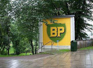
BP logo prior to 2000 redesign
BP logo (2000)
In 2000, BP’s mission was to project their appearance of “green growth” which led the petroleum company to set forth and redesign their logo to reflect that. The green Helios sunburst which became the new face of the company had a rumored rollout cost of $211,000,000. When the logo was first released it was not well responded to, and it took time for the uproar and negative reviews to die down. Things stayed quiet for a while, but in 2010, the “green” company was responsible for what is considered the largest marine oil spill in industry history: Deepwater Horizon. For a company trying to promote themselves as “green” in an inherently not industry, this incident only furthered the outrage.
Like this post? Read more at http://steverenner.com/blog-2/


No comments:
Post a Comment